UI / UX Design
GrowSwift
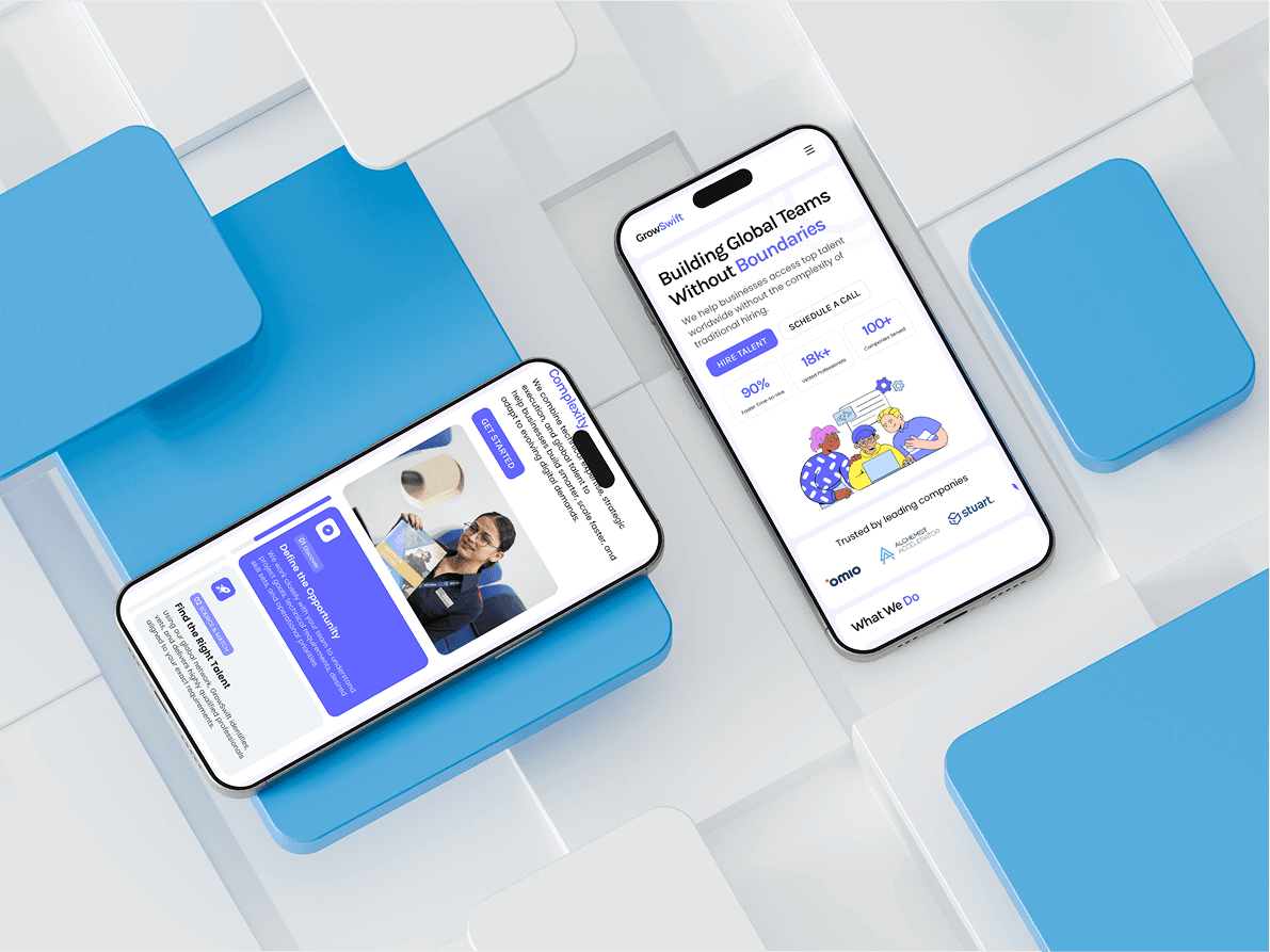
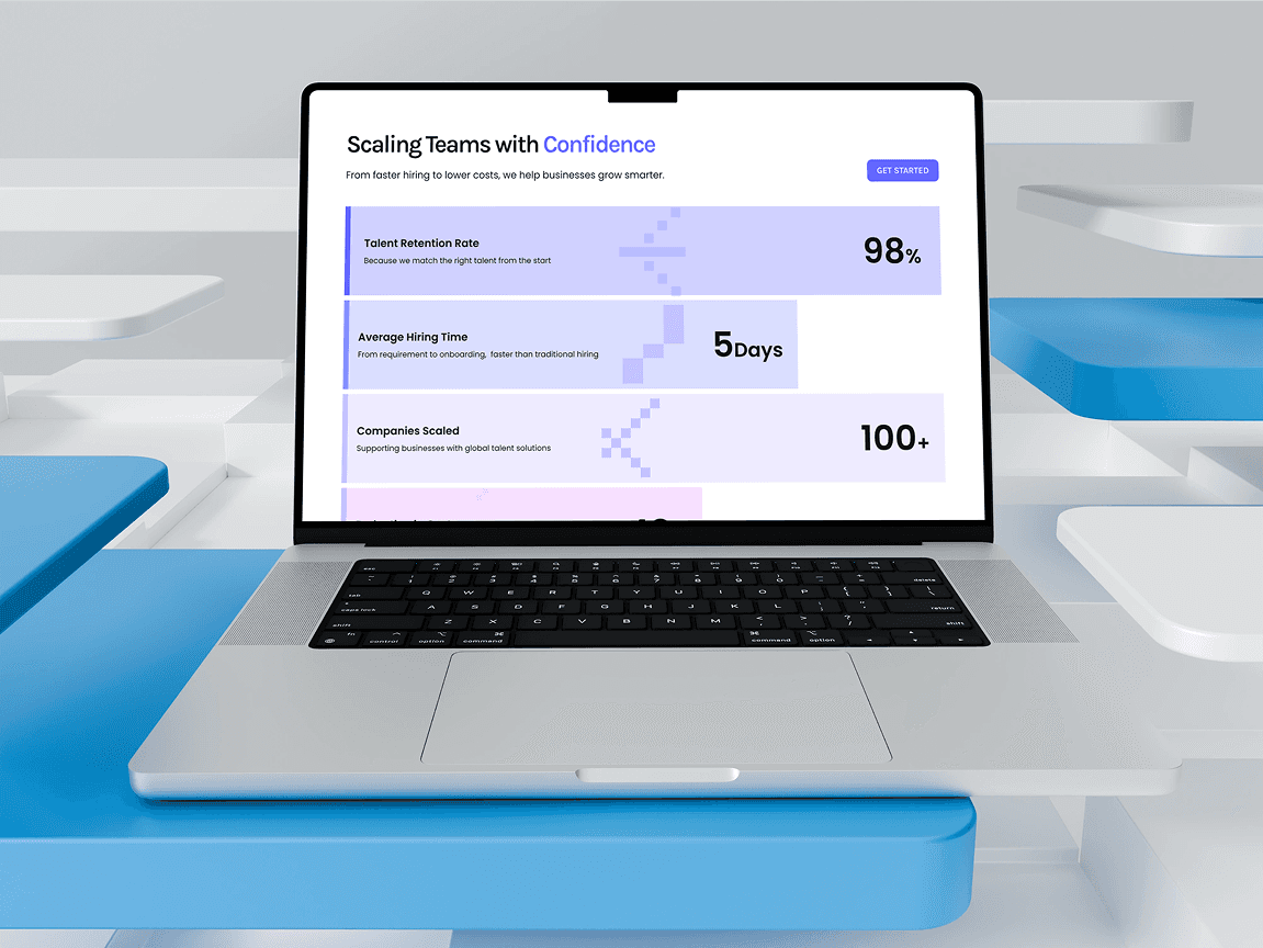
Designed a modern agency website for Growswift.io, using a bold visual direction, refined color palette, and custom infographics to create a premium experience built to attract high-ticket clients.
Year :
2026
Industry :
Design Agency
Client :
Growswift
Project Duration :
3 weeks

Problem :
Growswift.io is an agency competing for high-ticket clients - the kind who judge an agency's capability by its own presentation before reading a single word. Their existing web presence didn't match the caliber of work they were selling: it lacked a distinct visual identity, failed to communicate premium positioning, and gave prospective clients no compelling reason to believe Growswift operated at a higher tier than cheaper alternatives.

Solution :
I designed a complete agency website built around one principle: the site itself had to be proof of quality. I established a bold visual direction anchored by a refined, deliberate color palette, and created custom infographics to communicate Growswift's services and process -replacing the generic stock visuals that make agency sites interchangeable. Every page was structured to project authority, from the typography hierarchy down to the spacing system, so the experience felt premium before a visitor ever reached the pitch.
Challenge :
Premium" is the easiest brief to get wrong - push too hard and it tips into cold or pretentious; play it safe and it reads generic. The challenge was calibrating boldness with restraint: a strong visual voice that commanded attention without overshadowing the agency's actual message. The custom infographics were the turning point - they let the site demonstrate sophistication through substance rather than decoration.
Summary :
Growswift launched with a website engineered for its exact audience: high-ticket clients who buy on perceived caliber. The bold visual direction, refined palette, and custom infographic system position the agency as a premium operator from the first scroll - turning the website from a brochure into a sales asset. [Add a metric if available - e.g., increase in qualified inquiries or client feedback after launch.
UI / UX Design
GrowSwift
Designed a modern agency website for Growswift.io, using a bold visual direction, refined color palette, and custom infographics to create a premium experience built to attract high-ticket clients.
Year :
2026
Industry :
Design Agency
Client :
Growswift
Project Duration :
3 weeks
Problem :
Growswift.io is an agency competing for high-ticket clients - the kind who judge an agency's capability by its own presentation before reading a single word. Their existing web presence didn't match the caliber of work they were selling: it lacked a distinct visual identity, failed to communicate premium positioning, and gave prospective clients no compelling reason to believe Growswift operated at a higher tier than cheaper alternatives.
Solution :
I designed a complete agency website built around one principle: the site itself had to be proof of quality. I established a bold visual direction anchored by a refined, deliberate color palette, and created custom infographics to communicate Growswift's services and process -replacing the generic stock visuals that make agency sites interchangeable. Every page was structured to project authority, from the typography hierarchy down to the spacing system, so the experience felt premium before a visitor ever reached the pitch.
Challenge :
Premium" is the easiest brief to get wrong - push too hard and it tips into cold or pretentious; play it safe and it reads generic. The challenge was calibrating boldness with restraint: a strong visual voice that commanded attention without overshadowing the agency's actual message. The custom infographics were the turning point - they let the site demonstrate sophistication through substance rather than decoration.
Summary :
Growswift launched with a website engineered for its exact audience: high-ticket clients who buy on perceived caliber. The bold visual direction, refined palette, and custom infographic system position the agency as a premium operator from the first scroll - turning the website from a brochure into a sales asset. [Add a metric if available - e.g., increase in qualified inquiries or client feedback after launch.